Ranking All 32 NFL Logos From Worst To Best

This isn’t the most popular “football” in the world, but American football is hands-down the most popular sport in the country. It’s bonding. It’s big. It’s emotional. It’s a game where inches can mean a Super Bowl win.
This is a task that took me draft after draft to make, but it was a blast to do.
Before I officially get into my ranking, I want to list out the criteria (in no particular order of importance) that I used in my decision-making:
- Marketability and branding
- Aesthetic factor
- Creativity effort and uniqueness from other logos
- Cultural/historical significance
Some logos will rank on a varying scale with these criteria. For example, a logo may have a relatively high aesthetic factor but will otherwise be low on marketability. But it’s all fun. It’s not an exact science. It’s my opinion.
On that note, I also want to stress that my opinions bear no reflection on what I actually think about the team. Admittedly, there may be some bias, but there are some great teams that I actually rank pretty low on the scale. If your team is ranked low, it doesn’t mean that you suck. It’s all fun. Ranking logos, unlike football, isn’t a contact sport.
For a rough guide: KIND OF GARBAGE — 32 to 26. DO BETTER— 25 to 20. PERFECTLY FINE —19 to 15. DANG GOOD: 14 to 11. ABOVE AVERAGE: 10 to 6. S-TIER ECHELON: 5–1
So, let’s begin!
KIND OF GARBAGE
32. Cleveland Browns
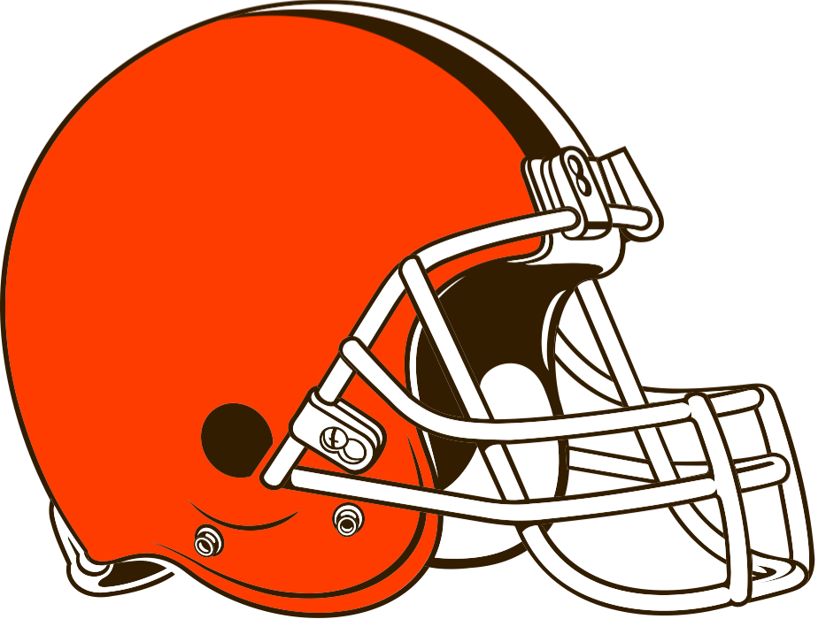
I understand the history behind the Cleveland Browns name — it was voted on by the public to respect the beloved football coach Paul Brown. Unfortunately, there isn’t much you can do to express that you’re the “Browns.” What is a brown? As a result, of all the NFL teams existing now, Cleveland has suffered from the biggest logo identity crisis.
There were the gremlin “Brownie the Elf” years. Disgusting. That’s what we want to play against — the angry Keebler Elf team. And I know that the Browns are trying to enter a bulldog era — excuse me, bulldawg. Not bad, but it feels so college football. U of M Duluth, Yale — it’s been done before. And this isn’t a dig at the college level, but you do want your team to feel like it’s a step above in professionalism.
Meanwhile, as far as the official, on-the-field logo being an orange helmet: I know that many Browns fans look at it with pride. Their history has been littered with them being royally screwed over by management — to them, the helmet is their logo because it’s the one thing they can fiercely claim for their team. “We don’t need the logo nonsense!”
Cute. Still the worst NFL logo.
31. New York Jets

Oh jeez, the poor Jets. Nothing really goes their way. Listen, let me commend anyone who’s a Jets fan for loving a team that has for years been the butt of the joke for the NFL. You’re all real for that.
But let’s look at this bullshit logo. It’s a football with the word “Jets” in it, with the J making a jet wing over the other letters. Because we’re the Jets — get it? All against a dark green backdrop. Vile.
Dark green has to really mean something for a team to make it work. You go dark green in football, you’re blending your team in with the field. Gross. But with that white? Everything about this feels half-baked. Dark green and white. That’s how you make yourself seem like a team that just doesn’t care about itself. Where’s the history? Where’s the passion? “Our logo is a green football…hiiiii…we’re the Jets….” I want to vomit. Moving on.
30. Washington Commanders

Hoo boy. This team. What I will say is that we no longer have the Washington Redskins. They finally moved on from 1960. So, I will definitely commend the Commanders for choosing a name that’s, you know, just fine…with a logo that’s, you know…just fine.
And that’s what this logo is. It’s fine. It’s not extraordinary. But what puts this logo so down to the bottom compared to other “just fine” logos is that ugly, awful dark burgundy. For a fall sweater? Perfectly fine color. For professional football? No.
This is the NFL. Have a little more oomph to your logo. I could see this working for a college logo — college is pomp and circumstance. It’s legacy. But the NFL? It’s not just history, it’s a show.
Dark colors bog down a team’s logo. Especially dark, warm colors. Ew, God.
29. LA Chargers
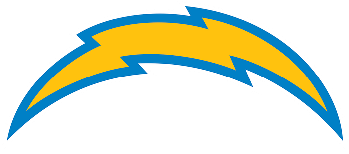
Now let’s look at the opposite of dark, warm colors — pale and light. Here we have the LA Chargers, which are praying to every God there is that Jim Harbaugh becomes their saving grace. For any crappy NFL team, I do want good things to eventually happen to the Chargers.
But this logo is so…it’s a lightning arch. I’ll give them uniqueness credit — they’re the only lightning team. With that said, there was so much you could have done to make this look threatening and more flashy. WAY more flashy — you’re a bolt of lightning, for God’s sake. But that baby blue outline and that absolutely generic shape…you want us to actually care about the Chargers, don’t you?
28. Cincinnati Bengals
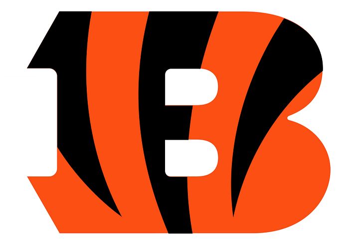
Yes. This is a good NFL team — great, even, especially when Burrow is healthy. But let’s look at their logo.
It’s a B with tiger stripes. Tiger stripes. That’s just silly.
You’re the Bengals. You are the tiger team. For a long time, you actually took advantage of this fact and used an actual tiger for your logo. The first tiger looked like it was pulled from a high school yearbook, though — awful design. The second tiger also has a kind of high-school feel to it, but it’s something. Again, you need to be fierce, flashy, professional, and proud of your legacy. On the field, you clearly show that. This is a city that is proud of their team, and rightfully so. But please, better branding. Hold off on putting chili on your spaghetti and figure it out.
An actual tiger for the Bengals will get you there — a well-designed, scary, memorable tiger. But instead, you’re going with a tiger-ified B. Instead of a tiger.
27. New York Giants
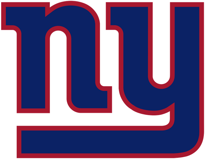
No matter how hard I try, I just can’t get behind this logo. There’s something painfully mediocre about it. What puts this so low to the bottom is the fact that there are better “letter” logos in the NFL. Way better. Keep in mind that a letter for your logo (despite everything I said about the Bengals) isn’t an immediate turnoff. Far from it. It’s all about how you sell the letters.
This logo is a lowercase “ny” — for a team called the GIANTS. Furthermore — they’re not the only blue-red-and-white NFL team, even in New York (see Buffalo). What a “who cares” kind of logo. Next.
26. LA Rams
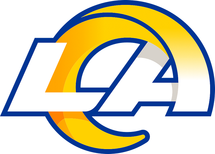
Yellow, white, and royal blue. These are very bold colors. This is not bad entirely, as you will see plenty of teams with primarily bold colors (see the Vikings — more on that later). However, there are a lot of brand logos that use blue and yellow. Think Best Buy. Think Ikea. Visa. Goodyear. I could go on.
It’s also a pretty popular color combination for schools. Think University of Michigan. Think of a lot of American high schools. Just Google it.
I want to think about the Rams when I see their logo, not Best Buy or my local private school.
And even though the Rams do a cool horn thing with their logo, it’s another letter logo. Booo….
DO BETTER
25. Indianapolis Colts

The simplicity of using something as recognizable as a horseshoe for this horse team could be great for branding (see the Cowboys for a similar example). Let’s add the fact that they’re the only other horse team besides the Broncos, which adds a sense of distinction to the Colts.
However, you don’t settle for a dark blue horseshoe with an otherwise undetectable white outline and call it a day. It’s veeeerrrry mediocre. It screams fine. If you’re going to use an inanimate object for your logo, you need to spice it up a little. Again, there’s only one horseshoe in the NFL — so, points to you, Colts. But you’re in the “do better” category for a reason.
24. San Francisco 49ers

Gold team color? Cool, you’re all about the gold rush! Plus, you have awesome team helmets for it. But…dark red? Hmmm…fine against the gold, sure. But again, dark, warm colors create a muddy look.
I never liked the 49ers’ name — it’s too long and loses its pep because of it. The fact that the name is also associated with such a long city name — San Fran-cis-co — just adds to the deflation of the brand. It’s like the Philadelphia 76ers — Phil-a-del-phi-a se-ven-ty six-ers. Good God.
With that said, the 49ers have built their brand up by being so damn good. We hear their name all the time, and with it, we see their logo. We get used to it. Their name carries a history — not just for the city in regards to their gold rush past, but a legacy in the NFL. But let’s not ignore facts. The branding of the team could be better.
23. Tennessee Titans
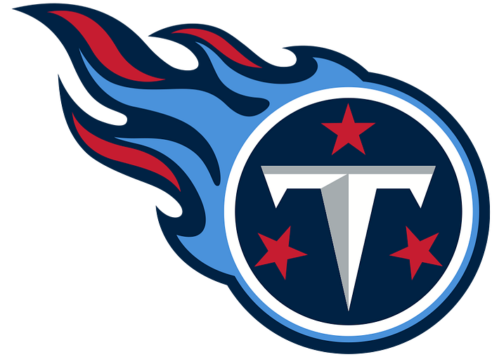
I’ll give the Titans points for giving their T a cool fire trail behind it. Still, there’s something about using light blue as a significant color that just gives me an ick factor for a team. It’s corporate. It’s a generic sports color. I understand that they used to be the Houston Oilers, which thus carried that blue over, but it’s such a weak color to represent your team.
The Tennessee Titans in general have been kind of a whatever team for me, too. I have very little interest in watching a Titans game ever, and this logo just solidifies my feeling for them. Moving on.
22. Tampa Bay Buccaneers
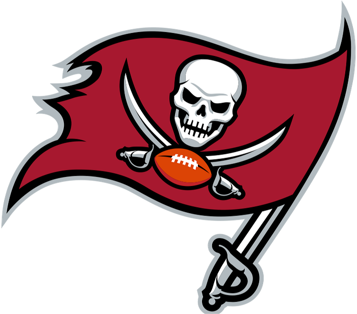
Yo ho ho! We got our first pirate team! And this pirate team has a SKULL in its logo. Whooo, bad ass. But let’s calm ourselves down — pirates are a Halloween costume now. This is also the Buccaneers we’re talking about. Tom Brady’s pre-retirement team. The Buccaneers certainly carry a kind of “fun” vibe to them, but I’m not going to give their logo or their brand any more credit than that. They’re pirates, and their logo is a dark red (gross) Jolly Roger with a football. Pretty. On. Point.
But, it’s fun! And fun does hold a lot of weight in the NFL.
21. Arizona Cardinals

The Arizona Cardinals, believe it or not, are the oldest team in the NFL. While they may not have the kind of legacy points that you’d see with the likes of the Packers or the Bears because of their franchise record, you do have to consider the historical factor that this team carries. This is a classic team.
About the logo — it’s bold. It’s another bird team (and a wimpy bird at that. A Cardinal. That’s for baseball), but this is a pretty mean-looking cardinal. The details are also dynamic and thick. It’s a memorable logo. The logo doesn’t feel like it should be given anything higher (because again — that ugly dark red! Choose a dynamic red instead) but it’s certainly a perfectly fine logo. The logo definitely, firmly says, “We are the Cardinals.”
20. Carolina Panthers

It’s a fierce-enough looking panther. Having light blue be the accent color to that sharp black is also a smart choice. Yet I find the whole logo to be just okay. The Panthers are yet another cat team — and there’s a better cat team logo.
I’m taking into account historical and cultural relevance. This team may have to build its image and reputation with time, which it will unfortunately struggle with for a while. Part of this is identity. Every team on this list brings together its city — and the Panthers are no exception — but I see nothing that uniquely represents the Carolinas. The logo’s shape has been said to reflect the Carolinas together, but…barely. Kind of. It’s not apparent enough.
It could do better.
PERFECTLY FINE
19. Seattle Seahawks

The Seahawks credit for is the way that their logo evokes Native American artwork of the Pacific Northwest. I respect that a lot, actually. It’s a great way to represent the culture of your region in a unique way.
With that said, I have to contend with a lot of old feelings when ranking this. I grew up with an Eagles fan for a father. Looking at the Seahawks, this has felt like a “different” version of the Eagles logo despite the fact that it’s existed for longer. In an older edition of this article, I called this a “bootlegged Eagles logo” and got called out for it…which, whatever. But I do need to raise this logo up.
I give points for effort, legacy, and branding. This Seahawks logo has all of those elements and then some. I have a hard time with gray in a logo, but it accents the Seattle spirit so well here.
There’s effort here. There’s spirit. There’s branding. It’s simply a good logo.
18. Jacksonville Jaguars
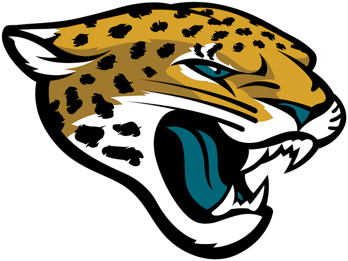
This isn’t just a jaguar. This is a jaguar with a weird, teal tongue growling at you. There’s a uniqueness to the logo, there’s distinction, and most importantly, there’s effort. Time was put into this logo. There are details. There’s care. Look at the jaguar spots. Look at how open the mouth is. Look at the whiskers, the ears. This logo says, “Yes, we care about our team.”
But, the logo is still just fine. The Jaguars have some time still to build up their reputation as a distinguished franchise — they do have an elite quarterback in Trevor Lawrence, but I do feel the bloat of there being three football teams in the state of Florida alone. To boot, JAX is the youngest of the Florida teams (Bucs 1974, Dolphins 1966, Jags 1993), and don’t hold nearly the kind of legacy that a team like the Dolphins do.
As far as we’re concerned, they’re another cat team, and for this reason, another cat head for a logo. It gets the job done.
17. Houston Texans
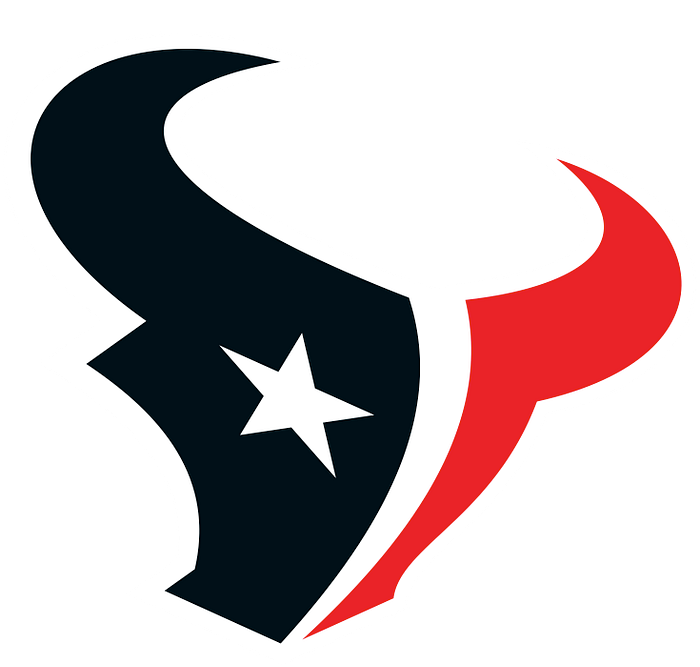
Cool longhorn logo. Cool incorporation of the Texas flag — the Lone Star is an eye. Dope.
All that considered, the Houston Texans are the youngest NFL team, becoming a team as recently as 1999. It’s younger than King of the Hill. For this reason, the team lacks legacy points that would put it over the edge against other more established franchises. It also doesn’t help the fact that they’re not the only dark blue-red-and-white team out there. See the Patriots. But is this a pretty cool logo? Certainly.
16. Detroit Lions
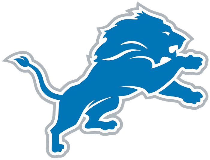
Listen. Sometimes, you’re just wrong.
When I first wrote this article, I put the Detroit Lions at #26 pretty much entirely because of the blue-gray color scheme. I’ve worked in industrial jobs, and that color scheme reminded me too much of those experiences.
That is until I moved to Michigan and really felt the spirit of the Lions.
Something I always believed but will highlight here further is the regal quality of this Lions mascot. Whether it be on a high-class beer label or an English crest, this lion feels like something that would be put on quality. The auto industry that gave the Motor City its name is not just about turning out product — cars are status symbols. Making cars is an art. This lion reflects that. And about the color…
I’m not changing my ranking because I’m caving. I really have grown to like this color scheme a lot more. It’s not the most aggressive color scheme in football, but that’s truly to its advantage. Enough reds. Enough blacks. Here’s a color that tells you about the city. The lakes, the sky, the blue collar jobs that built Detroit, the decades upon decades defining this team. And it’s criminal to not give a logo points for legacy.
It’s Detroit versus Everybody. We’re the Lions.
15. Dallas Cowboys
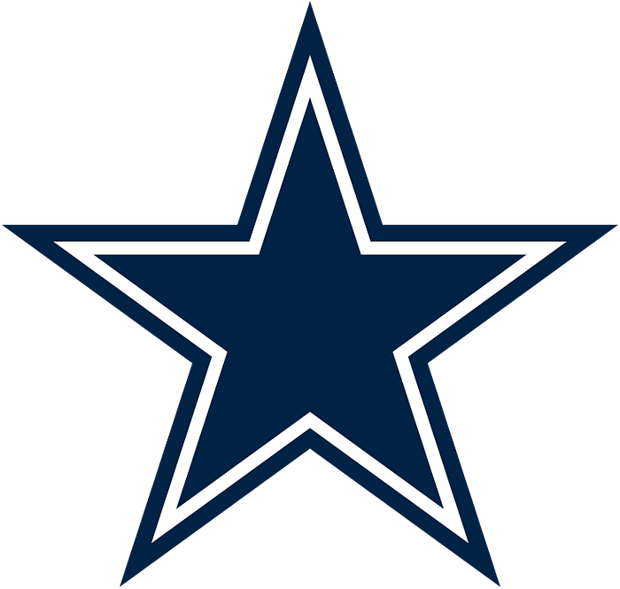
I will give the Cowboys major points for making something as generic as a star so iconic in football. Yes, the star is Texas’ Lone Star — it’s not just there for the sake of it. But it’s still a star.
Despite it being so iconic, its generic nature is a pretty significant reason why I can’t put this logo above other logos on this list. But damn was I tempted to.
It’s not even just a star — it’s a dark, navy blue star with a white inner outline. I feel so emotionally depleted watching the Cowboys play, and it’s not just because my dad is a huge Eagles fan. That navy blue just cannot pop, especially when there’s only white to help it out. Gross. At least the Seahawks have lime green to spice things up.
There are far and away worse colors you can use to represent your football team. But anything dark — not even just low on the color spectrum, but dreary and almost depressing — is hard to justify. There’s a difference between coming off as distinctive and coming off as assertive. If you’re a football team, you need to look assertive.
Again, though, you will always think of one team when you see that big, blue star on a football field.
DANG GOOD
14. Baltimore Ravens
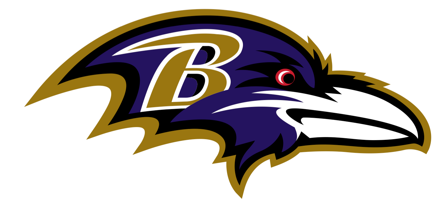
Even as someone who was a self-professed goth in high school, I never got behind the Baltimore Ravens’ black and purple color combination. Two really dark colors — where’s the distinction?
But this logo does the impossible and makes a bird look almost scary. Look at that red eye! Look at the jagged detailing of the feather outline.
Plus that gold. Wow! Talk about making the logo pop in a way most other teams don’t think to do. Plus with the “B” on the raven’s head, you just think without question, “Oh, this isn’t just the Ravens. This is (drumroll) the Baltimore Ravens!” It gets you pumped up.
The black and purple, though — that does affect my reception to it.
13. Las Vegas Raiders
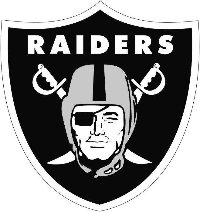
Black, silver, and white. Normally, I would put this quite low — womp, womp. Who cares about these colors? But it works here for the Raiders because the logo holds an undeniable old-school feel that adds not only distinction, but care and legacy. The facial detail of the Raider is fantastic. Plus, the fact that this is one of the few actual crests in the NFL makes this team feel like it’s worth celebrating, should you be a Raiders fan. Also, to go back to the Buccaneers pirate theme — here is how you swashbuckle, people. Two swords. An eyepatch.
Of course, there are much better logos — but this definitely deserves the title of “dang good.” It’s a good logo.
12. New Orleans Saints
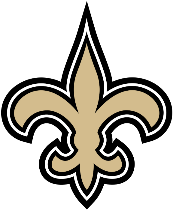
I’m putting the Saints in this category largely because of their heavy use of gold (giving them distinction and uniqueness as a team) and the fleur-de-lis as a logo to represent New Orleans’ French history. This is a logo with thought to it, and it’s well-designed. What a perfect use of black-and-white outlining here.
Of course, being that their team name is the “Saints” of all things, there’s no threatening quality to their franchise. Their logo acts in a similar manner. It’s a flower. A French flower. Ooh, scary.
But, it’s certainly classic, well-designed, and absolutely gets the job done in telling the world who the New Orleans Saints are.
11. Kansas City Chiefs

I’m not going to get into the Native American aspect of this because that is an entirely different article, if I even ever choose to get into it. Instead, I’m going to focus on the actual design of the Kansas City logo and how well it represents the team.
It’s an arrowhead with the letters “KC” in it. This is straightforward, plus there’s nothing goofy or caricature-esque about it — something that has befallen Kansas City logos in the past. They were a Saturday morning cartoon-looking gunslinger when they were the Dallas Texans, which then became a guy in a headdress running with a hatchet when they moved to Kansas City.
This has become an iconic logo, especially with their recent dynasty-era success. The clean nature of this logo makes it hard for me to put it lower on this list, too. It represents the team, it represents the brand (even if that brand is tone-deaf to Native Americans), and it is glued into the minds of football fans everywhere.
ABOVE AVERAGE
10. New England Patriots
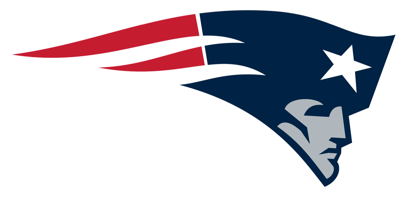
The old Patriots logo was pretty cool, but it suffered from being a full-bodied rendition of a patriot holding down a football. That’s too detailed, which affects marketability.
Enter this iconic Patriots head with an American flag effect tailing it. This is a classic, bold look for a logo that, thanks to the Brady years, has given this logo a sense of longevity and timelessness. I’m docking off points for the logo having pretty dull colors, but who can I blame? I’ve been to New England before. I know what it’s like. It’s cloudy. It’s weathered by the sea.
It’s the lowest-rated “above average” logo, but it’s above average nonetheless. It’s in the Top 10.
9. Pittsburgh Steelers
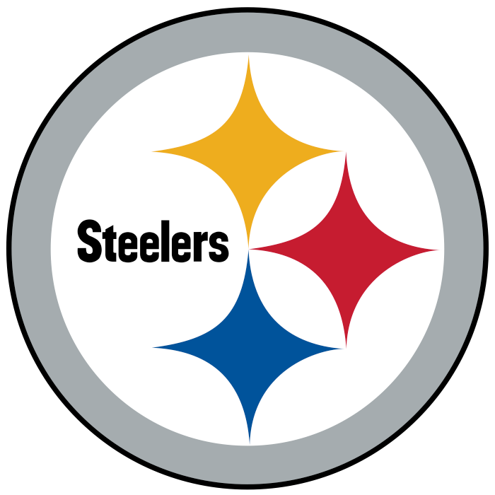
I love the Pittsburgh Steelers’ colors. For a team that could have easily gone with an industrial, dismal look because of its steel manufacturing history, the red, yellow, and blue stars really make the logo feel alive. There’s almost an energetic quality about there being three stars in a logo — the logo is representing a history. As someone who’s not from Pittsburgh, I couldn’t tell you the significance of the logo design, but it feels important.
A quick Google search, though, does tell me that the Steelers’ logo is based on the American Iron and Steel Institute’s Steelmark emblem. Hey, it means something important to the city! What do you know!
And a final note about the Steelers — compare them with the Detroit Lions, who also represent a blue collar city. Think about how this logo represents the city in such a different way than the Lions. You would be proud to be a steelworker in this city with this logo, with these colors. This is how you do representation right.
8. Chicago Bears
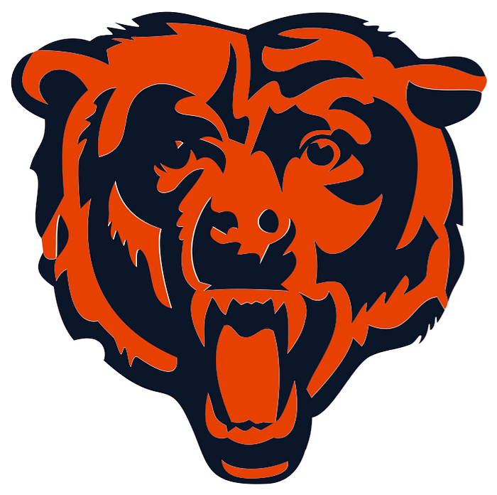
Oh, the Bears. Here we go.
What a rough few years they’ve had. My God. But a legacy? Oh, the Bears have that in spades. Existing since 1920, the Chicago Bears are one of the oldest teams in the league.
Legacy alone doesn’t constitute a great logo. There are plenty of worse logos of “legacy teams” in the NFL. But look at the colors of the Chicago Bears — orange and navy blue. If there was any other color than orange here, the navy blue would bring the team look down. Yet here we have that pop — that orange is energizing. It’s fantastic.
Finally, that bear looks like it’s actually trying to be scary. This ain’t Smoky. You see teeth. You see a wide-open jaw.
Here’s the thing about the Bears’ logo, though — its detailing does look kind of messy. I wouldn’t call this logo “clean.” Interesting to look at, though? Iconic? Yes, the Chicago Bears logo does have that.
7. Atlanta Falcons
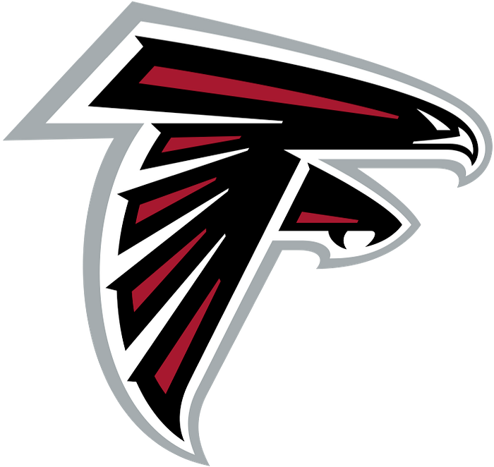
Uh-oh, another bird team. A dark red bird team, too — gross! But why is it so high on the list?
The Atlanta Falcons know how to design a bird well here. This bird isn’t just looking angry, he’s charging at you. And that silhouette — there’s no other silhouette like that in the NFL. Those wings are down. He’s coming to straight-up get you, shaped like an “F” while doing it. The bird has his talons out. You’re screwed.
And about the red? I’ll let it go. It’s not a boring, dull red. It’s a sharp, dark red, further coupled with that fierce black. Red and black — what a great look for a football team. Above-average.
6. Buffalo Bills
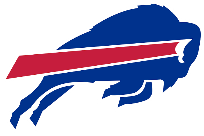
I went to school in upstate New York, so I love the Buffalo Bills. They’re my AFC team. I never liked that they were another blue-red-and-white team, though. It felt kind of generic to me. Granted, there’s a reason why they’re such popular colors — they’re a bold, energetic color combination without being too loud.
But about the logo itself — it’s a flying buffalo (I don’t know what else it’s doing — jumping?) with a red streak in front of it. It’s shooting to victory. Plus, there’s something angry-looking about that eye. He’s also out to get you.
Just looking at the design, though — what an iconic look. There are no other buffalo teams. There’s only one, and you can spot it a mile away — even with its pretty standard team colors.
S-TIER ECHELON
5. Minnesota Vikings
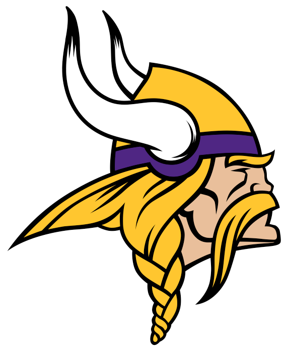
Yes. I’m a little bit biased. I’m a Vikings fan, and of course I’m putting this in the S-tier. But was I entirely biased when making this list? See #1 to find out.
But in all seriousness, compare the Vikings logo with other teams in the NFL. How many teams have the distinction of being the team to represent their team color? Seattle can do all they can to make lime green a little bit their thing, but the NFL is otherwise a sea of reds, blues, whites, blacks, and yellows. But with the exception of Baltimore using it as a bad accent color…there’s only one purple team.
The Vikings logo is one of the few NFL logos that has remained largely unchanged all throughout its history. Go back to a 1970s game, and you see coach Bud Grant wearing this logo on his hat. The braid and beard detailing has changed a bit, but it’s otherwise an absolutely timeless logo. This Viking logo represents Minnesota’s cultural history and has that furrowed, focused brow to give him the look that he’s going into battle. To Valhalla he goes!
There’s a lot of detailing to the logo, however. While this does denote care and attention (something that is absolutely a plus), it can affect marketability outside of the Vikings fanbase. And, as much as it pains me to say, there are teams with better legacies ahead of the Vikings on this list. Boooo…I want a Super Bowl win. Well, me and eleven other teams.
4. Miami Dolphins
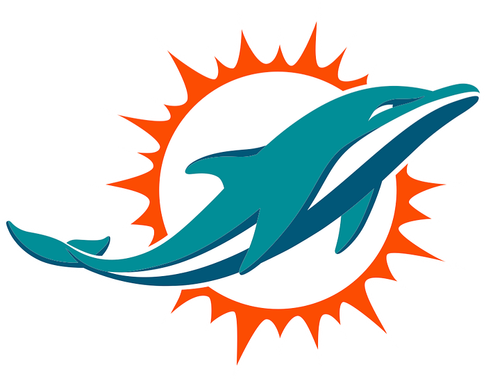
Dang it, I just feel happier when I see the Miami Dolphins logo. It’s a dolphin flying into the sun! Whoopee! To that end, it’s also not cartoonish. It does take itself a little bit seriously.
I’d also consider the Dolphins to be one of “those NFL teams” that people all over the country are going to be familiar with. While the “dolphins” isn’t the fiercest name for a football team, it does fit Miami well. When looking at the overall Dolphins brand (the past twenty years were stupid, save for the McDaniel-era revival), you can’t ignore the absolute dominance the Dolphins had during the Don Shula years. That was a while ago, so it perhaps doesn’t matter anymore — but I would definitely consider the overall legacy of the Miami Dolphins to be on the positive side, especially with this logo.
It’s also a unique yet eye-pleasing color combination. The dolphin is a light teal, and that orange sun makes everything blend together. It’s tropical. It’s bold.
3. Denver Broncos
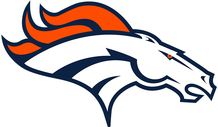
Orange is one of my favorite NFL colors because it’s so bold, so fierce, and so dynamic of a color. Here we have the only truly orange team of the NFL with the Denver Broncos, and their logo encapsulates them well.
While not the only horse team, they are the only horse logo. They are the HORSES of the NFL, and you don’t want to forget about them. They had the Peyton Manning and John Elway years, which certainly helped put Denver on the map, but even when you consider their currently lukewarm success now…this logo is a mad orange-white-and-blue mustang huffing and puffing your way. This is a great logo. It’s got a great level of care and attention to it without it being too much. The detailing of the horse’s head muscles (especially around the jaw) really add that level of dynamic power to the logo.
Yes. It’s a #3 logo.
2. Philadelphia Eagles
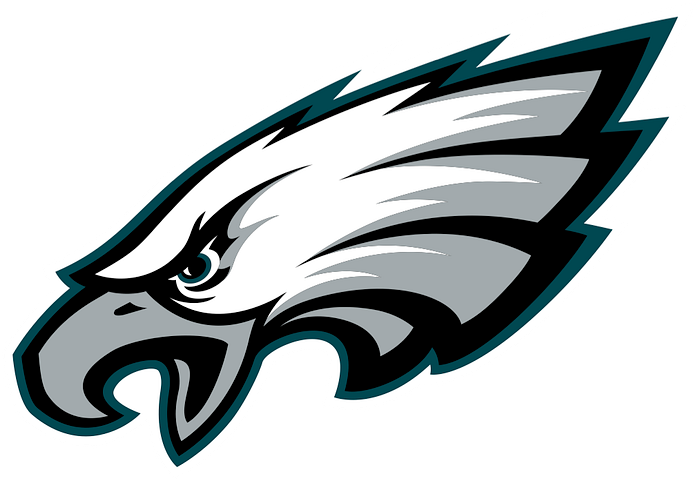
Another bird team, but this team is absolutely in the right to use a bird’s head. The old Philadelphia Eagles logo showed a full-bodied eagle which, like the Patriots’ old logo, looked cool but affected marketability. It was, again, too detailed.
But of all the bird teams, this Eagles logo is by far the most memorable. For one, let’s look at that dark teal green. Uh oh — dark green. But wait — it’s specifically Philadelphia Eagles green. Teams that know how to make a color truly their own get a huge A+ in marketing. Plus, dark teal green is different than any other dark shade — it’s a cool-toned color with a touch of warmth. This is an interesting-looking green that you can distinguish a mile away to be associated with the only Eagles in the NFL.
But let’s look at that bird. Those eyes are the angriest bird eyes I’ve seen in any of these logos. That mouth is not closed — he’s not charging at you. It’s open — he’s cawing. He’s yelling. He’s letting you know he’s after you.
There’s also another careful detail. The Eagles logo is the only logo facing left instead of right — so the feathers create an “E.” Oh, clever.
Fly, Eagles, Fly.
But it ain’t #1.
1. Green Bay Packers
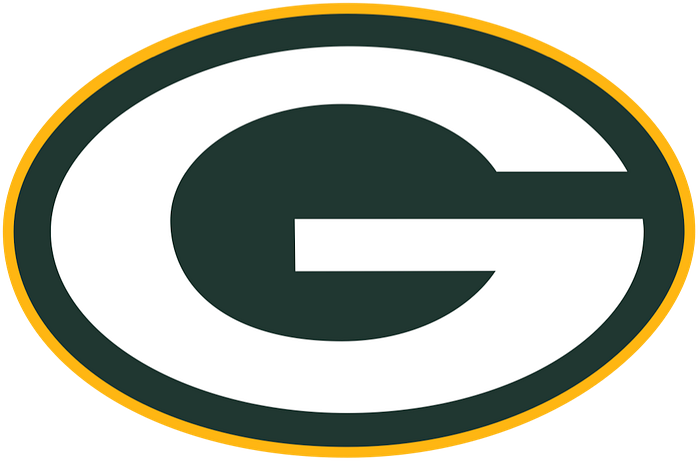
It’s football-field green. It’s a big, generic letter. It’s committing most of my main sins for putting a logo down low. It’s even kind of ugly.
And yet. It’s unquestionably the Green. Bay. Packers.
Believe me, as a Vikings fan this hurt to put in the top spot. But I absolutely could not deny the importance of this logo in the space of football. Of every team in the NFL, the Packers logo is the logo that people will always remember. This logo is so good in football that a very similar variant of it is used by the Georgia Bulldogs (with the Packers’ blessing, of course).
Yes, they’re a gross dark green, but my God do they own it, and that makes all the difference. They’re a classic team. I’d also consider the Packers’ fanbase to be one of the most loyal fanbases in all of football. The fans own the team — they’re the only NFL team with that distinction.
Marketable, well-designed, purposeful, historical, and uniquely representative of the Green Bay Packers. It’s quite impressive that, unlike a team like the Browns, the Packers never had an identity crisis with their logo. What is a “packer?” They’ve never had an issue telling you. The Packers are them. Period.
Gold and green outline, with a white G. One may call it straightforward, boring, maybe even a little ugly, but this is a confident team that was founded all the way back in 1919. Go Pack Go.
God, that felt gross for me to write. Okay, back to being a diehard Vikings fan.
